Worried About Stocks? Read This Now…
Last week, I told you why I’m personally getting a little worried about the markets.
I also urged you to take a good, hard look at your investments to make sure you’re comfortable with the risks you’re currently taking.
(If you missed it, be sure to catch up right here.)
However, I also told you that there was no reason to panic at this time. And a big reason why was what our TradeSmith market health tools were indicating about stocks.
Today, I’ll introduce you to these tools and show you what they’re saying right now.
The first is our TradeSmith Market Outlook tool. This tool provides a quick but comprehensive view of the overall health of 12 important global market indexes.
Seven of these are based here in the U.S.:
- The Dow Jones Industrial Average, the Russell 1000 Index, and the benchmark S&P 500 Index, which all focus on U.S.-listed companies with large market capitalizations (“large-cap stocks”)
- The Nasdaq-100 index, which focuses on large-cap, non-financial stocks
- The S&P 400 Index, which focuses on mid-cap stocks
- And the S&P 600 Index and Russell 2000 Index, which focus on small-cap stocks
The other five are based outside the U.S.:
- Australia’s benchmark S&P/ASX 100 Index
- Canada’s benchmark S&P/TSX Composite Index
- Hong Kong’s benchmark Hang Seng Index
- Japan’s benchmark Nikkei 225 Index
- And the U.K.’s MSCI United Kingdom Index
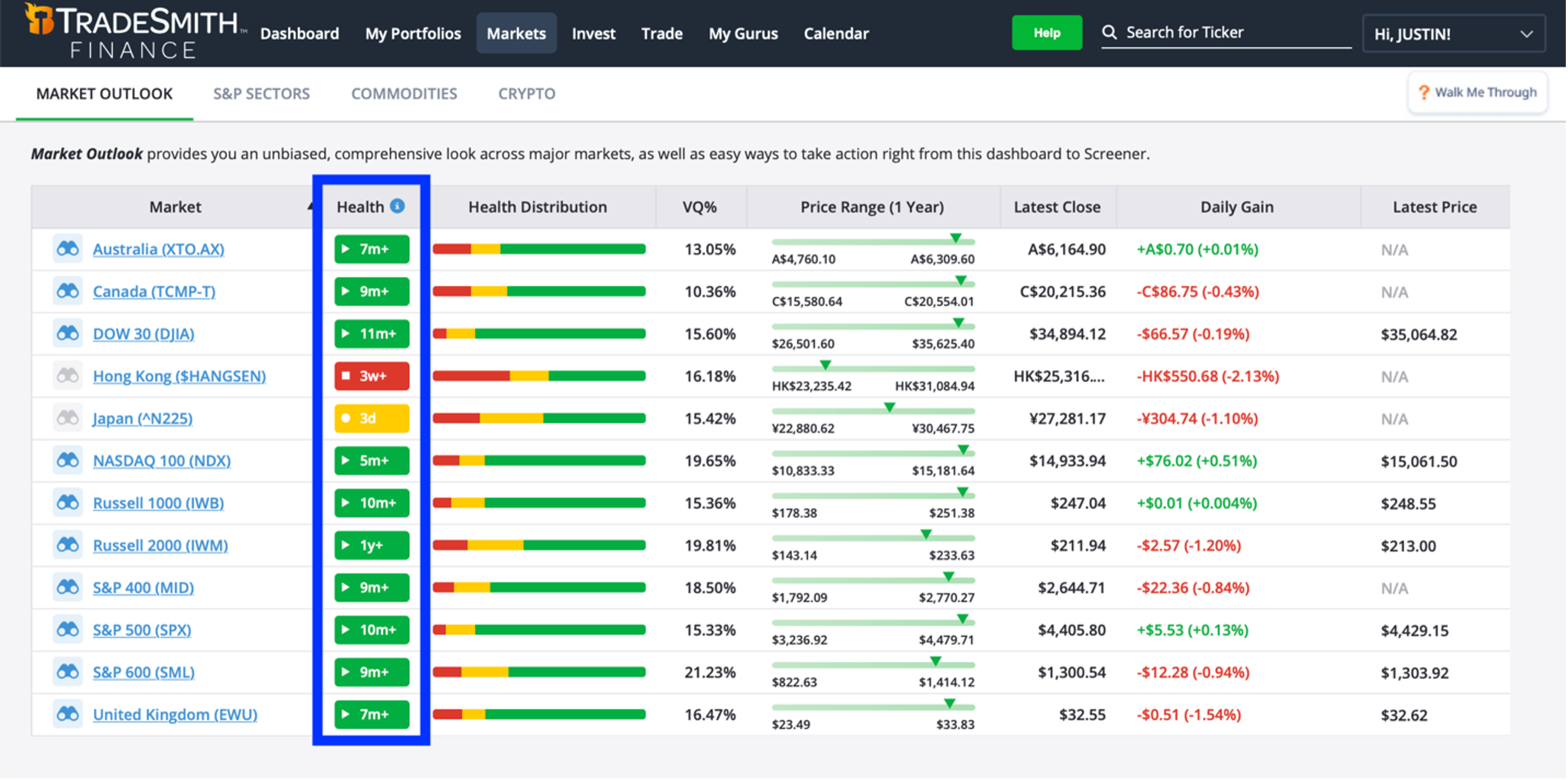
Here’s what our Market Outlook tool looks like today. The most important columns to pay attention to are “Health” and “Health Distribution,” which I’ve outlined in blue.
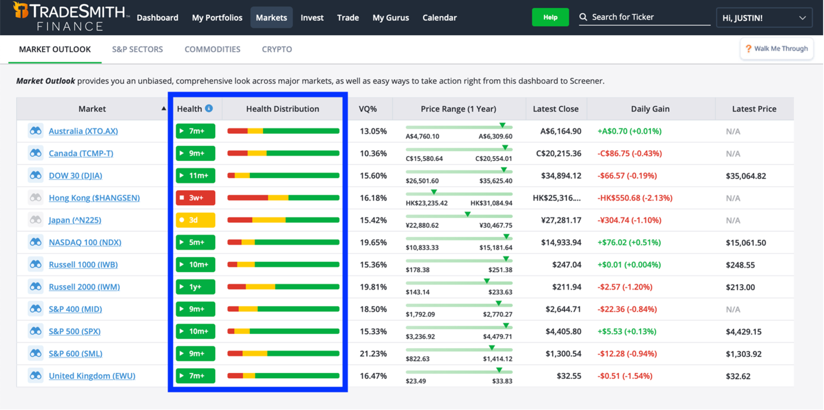
The “Health” column shows the current TradeSmith Health Indicator status for each market index.
I explained how our Health Indicator system works when we discussed trailing stops earlier this year. In short, it uses our proprietary Volatility Quotient (VQ) — along with a handful of other algorithms — to tell you the overall health of an asset (or index) at a glance.
As I mentioned then, it works something like a traffic light.
Green means “go”: Assets in the Health Indicator Green Zone are behaving normally and are in a healthy state. At TradeSmith, we usually consider these assets a “buy.”
Yellow means “proceed with caution”: Assets in the Yellow Zone have pulled back more than halfway toward their Health Indicator trailing stop loss but are not yet in an unhealthy state. These assets are usually a “hold.”
And of course, red means “stop”: Assets in the Red Zone are in an unhealthy state. They have fallen below their Health Indicator trailing stop loss and are not behaving normally. These assets are usually a “sell.”
This color-coded system works the same way for market indexes.
If you take another look at that chart below, you can see that most of the market indexes we follow are currently in the Green Zone.
Only one (Japan’s Nikkei 225 Index) is currently in the Yellow Zone. And just one (Hong Kong’s Hang Seng Index) is in the Red Zone.
That is fantastic news. It tells us that most of the global market indexes we follow — including all seven U.S. indexes — are currently in a healthy state. Unless this begins to change, there’s simply no reason to get bearish.
But our market health tools offer another powerful indicator that isn’t available for individual stocks or other assets. That’s the “Health Distribution” tool I mentioned earlier.
This tool applies our Health Indicator system to all the individual component stocks within an index or sector. It then tallies the results and displays the percentage of stocks in the Green, Yellow, and Red Zones.
The Health Distribution can give us valuable information we can’t get from the Health status alone.
For example, if an index is in the Green Zone, but many of the stocks within it are in the Yellow or Red Zones, it can signify that something isn’t quite right. The index may not be as healthy as it appears on the surface, and there could be trouble ahead.
Likewise, if an index is in the Red Zone, but many of the stocks within that index are in the Green Zone, it can be a positive sign. It suggests the index may be healthier than it appears, and a new “buy” signal could be just around the corner.
If you take one more look at the same chart below, you can see that most stocks within the 10 healthy indexes are currently in the Green Zone. Only Japan and Hong Kong have less than 50% of their component stocks in the Green Zone today.
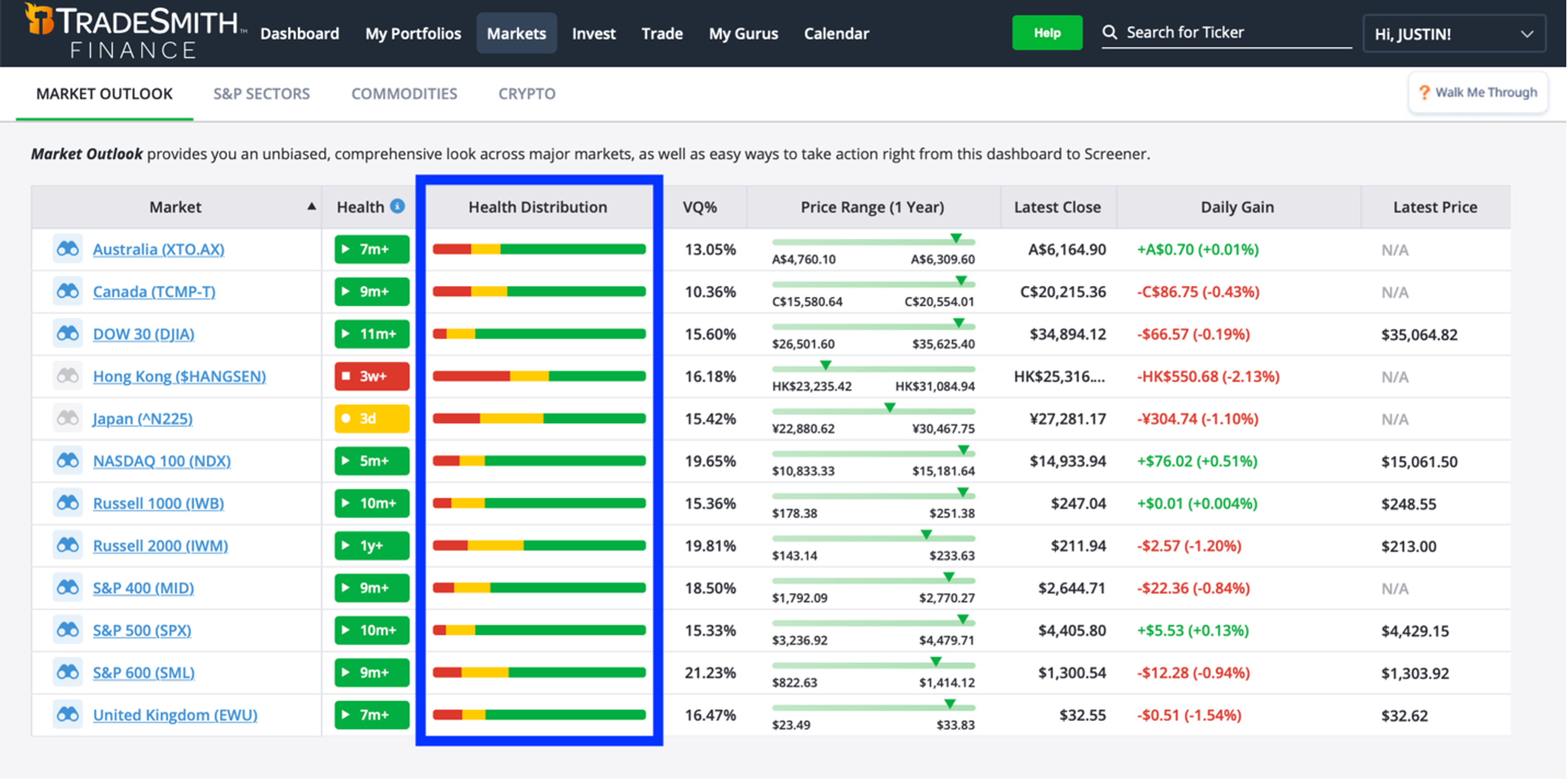
In other words, most of the indexes we follow (including those of the U.S., Australia, Canada, and the U.K.), and most of the individual stocks within those indexes, are currently in a healthy state.
That is exactly what you want to see if you own stocks in those markets. And again, there is simply no reason to get bearish unless this begins to change.
Our second market health tool is sending a similar message.
The S&P Sectors tool uses the same indicators as our Market Outlook tool, except it’s focused on the 11 individual market sectors here in the U.S.
This tool gives us an even more detailed view of the health of U.S. markets than we can get with the Market Outlook alone.
As you can see below, 10 of the 11 sectors are currently in a healthy state. One sector — Energy — just dipped into the Yellow Zone yesterday.
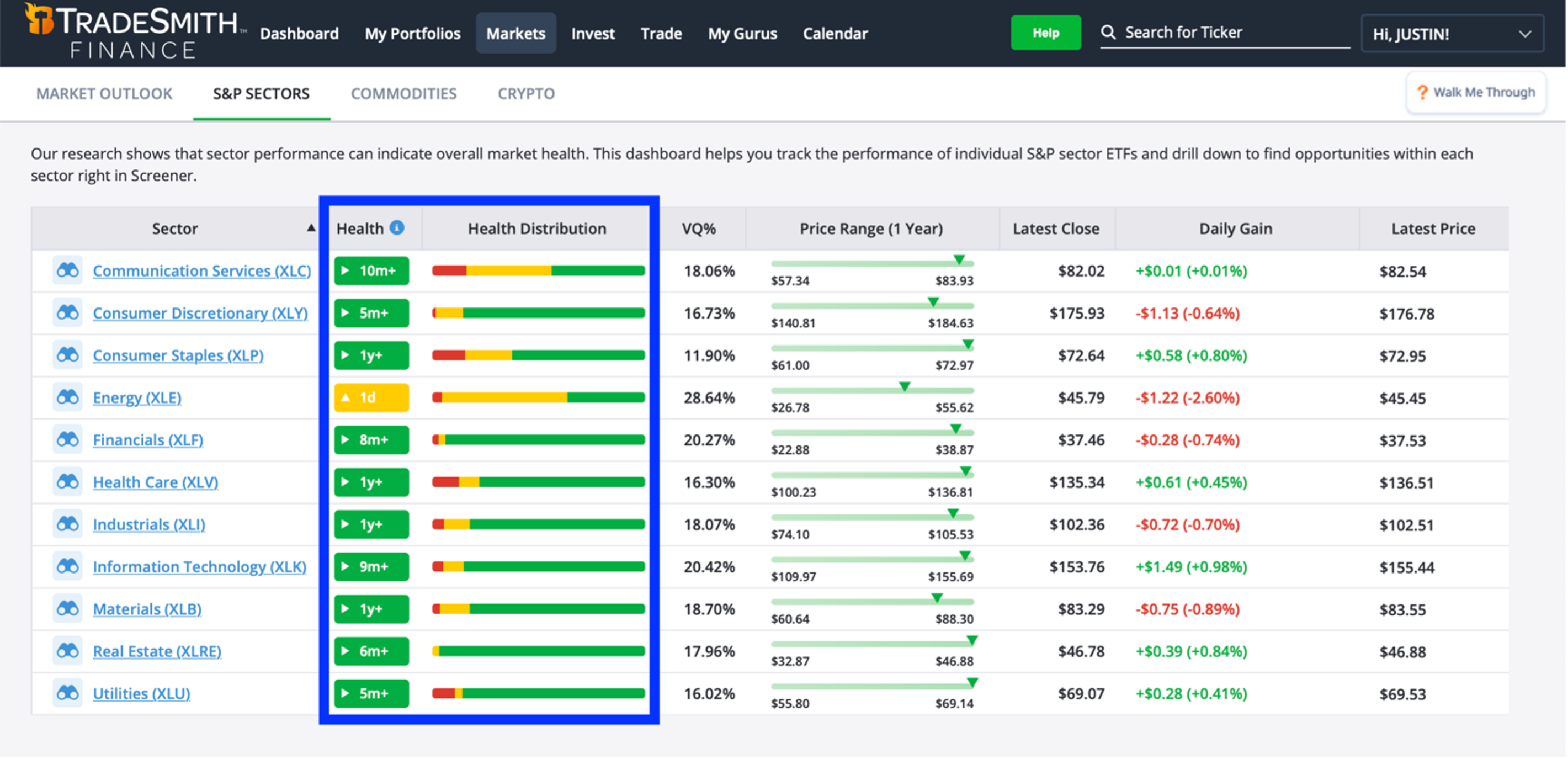
That’s great news, too. Our research shows it’s generally a bullish sign for the overall U.S. market whenever eight or more sectors are in the Green Zone, like we see today.
The Health Distributions of these sectors are also looking good. Nine sectors currently have most of their component stocks in the Green Zone. And seven of those have a whopping 80% or more of their stock in a healthy state. There’s nothing bearish about that!
Of the 10 healthy sectors, only Communication Services currently has less than half of its component stocks in the Green Zone.
My team and I will be keeping a close eye on this. But as I mentioned before, unless we begin to see broad deterioration in these indicators, there’s simply no reason to get too bearish just yet.
I hope this peek at our proprietary TradeSmith market health tools has helped ease your mind about the market. But I’m not done yet…
You see, we have developed one more market health tool I want to share with you. And I think it’s even more powerful than the ones I just showed you.
In fact, it’s the most reliable bear market warning system I’ve ever come across.
This tool personally saved me — and thousands of TradeSmith subscribers — from the March 2020 crash. And next week, I’m going to share it with you, too.
In the meantime, if you have any questions or comments on what we’ve covered so far, you can email me directly at [email protected]. As always, I can’t respond to every email, but I promise to read them all.