Two Powerful Buy Signals to Look for From Here
The stock market’s recent drop I wrote about previously appears to have stabilized. But concerns about resurgent inflation – and therefore higher-for-longer interest rates – remain a big wildcard.
Recall that in this pullback, which began on April Fool’s Day (you can’t make this up), the number of declining stocks on the NYSE outpaced advancing issues by a wide margin of 5-to-1 in three out of four trading sessions.
Since then, the S&P 500 Index (SPX) declined about at the recent low on Friday, April 19, before bouncing back over the past week.
Upbeat earnings reports have helped support stocks in a big way. So far, 79.2% of SPX companies have reported first-quarter earnings above analysts’ expectations, while only 15.1% have missed. What’s more, positive earnings surprises now stand at 9.3% above estimates!
Those are excellent results. Still, stocks haven’t surged higher despite the strong profits.
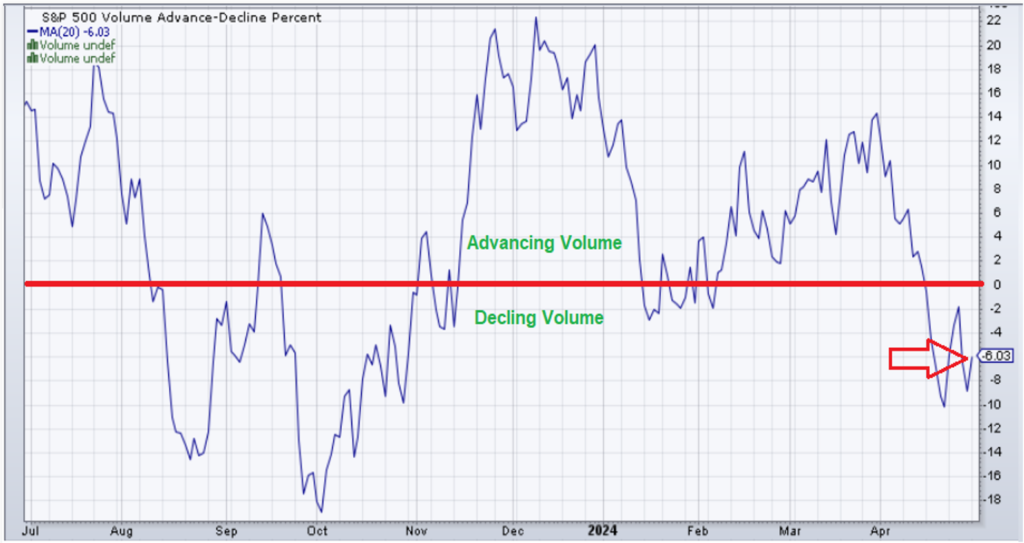
The chart below shows the percent of advancing vs. declining trading volume in S&P 500 stocks. This measure of market breadth was bad at the beginning of this pullback – and it’s still bad now. As you can see, the ratio of declining volume continues to outpace advancing volume even after the recent market bounce:
And my colleague Jason Bodner’s own analysis confirms the magnitude of selling. In fact, Jason just spotted the most consecutive days of Big Money selling since last fall’s 10% correction in the S&P 500 Index.
In his graph below from Quantum Edge Pro, you can see the drop in the S&P 500 tracking ETF (SPY) shown by the white arrow. You can see the pickup in selling by the red bars circled at far right of the graph:
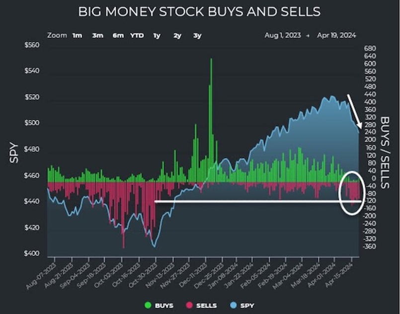
Jason’s Big Money Index (BMI) dipped to 49.3 last week, down from above 53% the week prior. That means Big Money signals are now about equally divided between buys and sells. But despite the market dip, we’ve yet to see a strong pickup in Big Money buying.
Typically, his BMI signals caution when the index crosses down from above 80%. And once BMI reaches a low point and turns back up above the 25% level, as it did at the end of last October’s market correction, that can produce a powerful buy signal for stocks. We’re not there yet.
Let’s revisit my chart of the S&P 500 from my previous issue to see where we stand now:
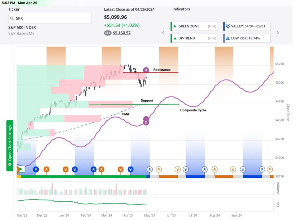
Resistance for SPX stands at the red line, roughly 5,050 to 5,125. The next key level to watch is the green support line near 4,750.
That price level lines up nicely with a substantial Volume at Price bar (green and red bars), indicating plenty of trading volume supporting these prices. Also, our Smart Moving Average for the S&P 500 lies in the same vicinity, which makes for even stronger support.
Note that our Composite timing cycle (purple line) remains in an overall uptrend as well. There is a peak turn area (orange shading) coming up from mid-May to early June, before the next valley upturn area (blue shading) in July.
As for market price action, I’d like to see SPX decisively break out to the upside through that 5,100 area on convincing volume, ideally with a strong rebound in Jason’s Big Money buy signals. In the meantime, stocks could meander lower toward the 4,750 support area.
But the good news is that in the past when the index and Jason’s indicators have dropped quickly like this, stocks almost always rallied strongly over the next six to 12 months. Here’s the proof from Jason’s own BMI signal data:
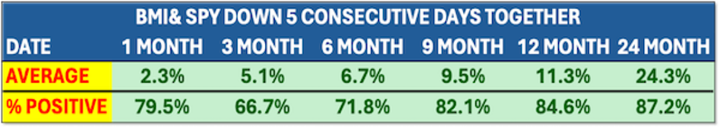
Following the kind of heavy selling pressure we’ve just experienced, the S&P 500 was significantly higher over the next 9, 12, and 24 months. And get this, the index posted average gains of 24.3% two years later, up 87% of the time!
So, what to do now?
Keep a watchful eye on our TradeSmith Market Outlook page for clues about where stocks are headed. Subscribers can access this page by simply clicking on Markets from the main dashboard menu.
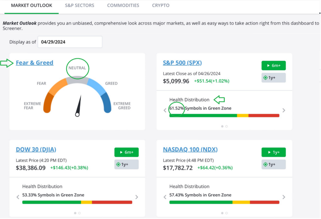
As it stands now, we’re dealing with a healthy stock market that’s simply undergoing what appears to be a normal correction. As you can see above, sentiment is neutral according to our Fear & Greed indicator. That’s down from Extreme Greed in last March, a positive development for market health.
Speaking of which, notice that our SPX Health Distribution shows the majority of stocks (61.52%) are in the Green Zone. And the same is true for the Dow 30 (DJIA) and the Nasdaq 100 (NDX).
Meanwhile, only 28.5% of SPX stocks are in the Red Zone. That’s a healthy market. Keep a watchful eye on these metrics at least on a weekly basis, if not daily, for any change.
Mike Burnick’s Bottom Line: Watch the support and resistance levels for SPX as shown in the chart above and be sure to keep a watchful eye on the Market Outlook page on TradeSmith Finance for any changes in the data.
Good investing,

Mike Burnick
Senior Analyst, TradeSmith