Making the SSI Trend your friend
One of the biggest mistakes we see investors make is focusing too much on capturing the turn-points at market bottoms and tops. Yes, we all love to nail the bottom to the day and sell at the exact top, but as a long-term wealth building strategy, it just doesn’t work. We’re much better off capturing the meat in the middle.
Today we’d like to share with you more about how you can leverage the SSI Trend indicator in TradeStops to help you master the middle.
The SSI Trend indicator was originally developed as a core component of the “Re-entry Rule” – the signal that tells us when it’s safe to get back into a stock that had been previously stopped out. We needed a trend indicator that helps us distinguish good bounces off the bottom from bad ones. A “good” bounce is one that follows through to the upside. A “bad” bounce is one that fails and is soon followed by new lows.
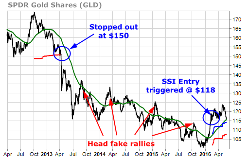
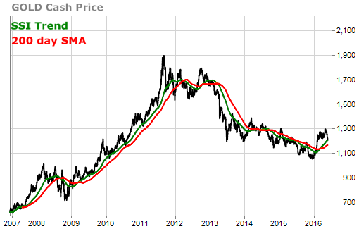
We’ve shown the below chart before but it’s still one of our favorites.
It shows how the SSI Trend indicator helped us to know that the bounces in gold from 2013 – 2015 were not likely to have upside follow through. It wasn’t until the SSI Trend finally turned solidly up in early 2016 that the SSI system gave the all clear on gold.
Over time, the SSI Trend indicator (f.k.a. the “smart moving average”) has become an increasingly important part of TradeStops. We’d like to take a little time today to make sure that you understand how it works and how to get the most benefit from it.
The first thing to understand is that the SSI Trend indicator is unique to every individual stock and index in our database. It isn’t a “one-size fits all” moving average like the popular 200-day moving average or 50-day moving average.
The SSI Trend was engineered to be THE single best moving average at capturing bounces off of the trend for the asset or security in question.
Here’s a chart of the SSI Trend indicator on the S&P 500 to help show you what we’re talking about.
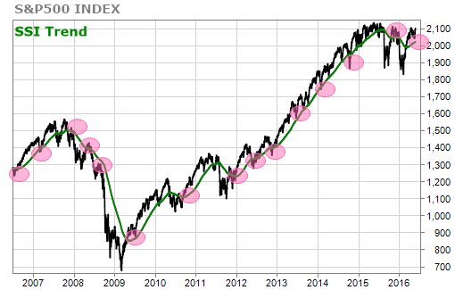
The above chart shows how the SSI Trend on the S&P 500 has routinely served as both strong support and resistance for corrections and rallies.
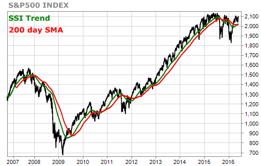
The next chart below contrasts the proprietary SSI Trend with the widely used 200-day simple moving average (SMA).
In this case, the two are not all that different (the current period on the SSI Trend for SPX is 182 days) but hopefully you can see how price has tended to bounce more consistently after touching the green SSI Trend as opposed to the 200-day SMA.
Here’s another example – gold. Again, the red ovals highlight the times when price has pulled back during a bull trend (or rallied during a bear trend), kissed the SSI Trend line, and then promptly bounced and returned to trend.
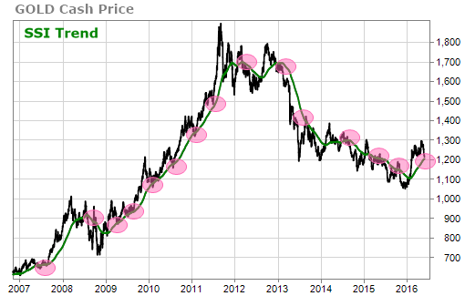
Contrasting the SSI Trend on gold (currently 170 days) with the 200-day SMA in the chart below shows how the proprietary SSI Trend has been a tighter indicator of support and resistance than the more widely followed 200 day SMA.
Finally, let us share with you a more dramatic example – Apple Inc. Here we can again see how the SSI Trend supports bounces up from trend during uptrends and bounces down from trend during downtrends.
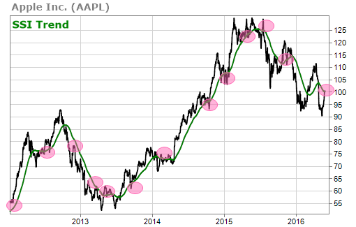
The current SSI Trend on AAPL, however, uses only a 75 day period. Unlike what we saw for S&P 500 and gold, there is a big difference between the SSI Trend for AAPL and the 200 day SMA for AAPL. Take a look.
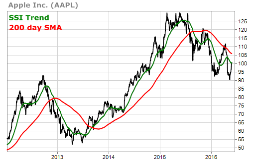
You can really see in the chart above how the SSI Trend has been engineered to hug the price line and how it is definitely not a one-size-fits-all trend indicator.
With the SSI Trend you don’t have to guess if you should be looking at a 50-day, 100-day or 200-day moving average. You don’t have to worry if you should be using a simple moving average, an exponential moving average or a weighted moving average. You know that with one trend indicator you’ve got the best shot of knowing where your favorite stocks and securities stand with respect to their trends.
As we mentioned above, the SSI Trend is currently one of the big components of the SSI Entry signal. If a stock was stopped out in the past then we look for 2 things before re-entering – a bounce greater than VQ% and a significant upward slope in the SSI Trend.
In addition to this important function, there are other ways that you can now leverage the SSI Trend tool in TradeStops as well.
We currently tell you what the SSI Trend is when price pulls back into the yellow low-risk zone from the SSI green zone. The trend is indicated by the up triangle, circle or down triangle:

The SSI Trend is a powerful proprietary indicator in TradeStops. It can help you to make the trend your friend and to capture the middle section of big moves by avoiding bottom fishing and/or selling too early. We expect the role of the SSI Trend indicator in TradeStops to continue to evolve in the coming months and years.