Spot Short-Term Health Trends with This Brand-New Tool
Our crackerjack development team here at TradeSmith is consistently working overtime to create new indicators and strategies to help boost your investment success.
And starting today, you’ll notice a key enhancement to the Chart section of our website: Introducing the all-new Short-Term Health indicator!
Let’s take a closer look at AI favorite Nvidia (NVDA) as an example. Simply type the ticker NVDA into the Search for Ticker window, then click on Chart, as shown below:
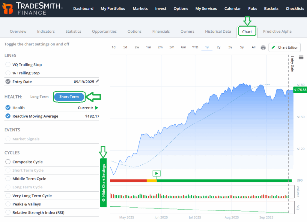
Next, open the Chart Settings window, and you’ll notice the new Short-Term Health Indicator displayed alongside our proven Long-Term Health Indicator.
Please Note: Members with subscriptions to Trade Stops, Trade360, and TradeSmith Platinum can access this page. If you don’t see this valuable tool in your TradeSmith Finance platform – and you’d like to – give our Customer Care team a call at 888-623-0858 to find out how to get access.
We’ve taken our well-recognized Green-Yellow-Red Health Indicator and created an all-new version geared toward shorter-term investing.
This makes it easier for you to decide when to buy, hold, or sell – any stock that’s ideal for swing traders or for anyone with a shorter-term investment outlook.
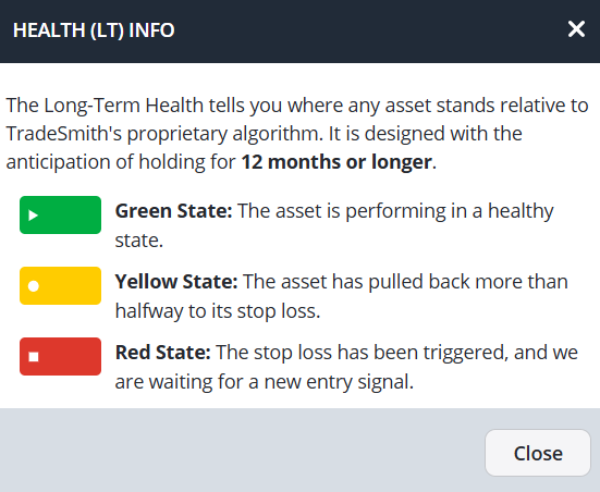
Our proven Health Indicator system is designed to help you quickly assess the health condition of any stock at a glance.
Health Indicator Refresher
Here’s a quick refresher…
And take a look at how you can best apply our Health Indicator system to your own investing.
- When a stock moves from the Red Zone into the Green Zone, it triggers an entry signal, telling you it’s okay to consider buying.
- A stock in the Yellow Zone is still healthy, and if it moves back into the Green Zone, that suggests it’s okay to consider buying the dip.
- But when a stock moves from the Green or Yellow Zone into the Red Zone, it’s an exit signal – what we call a Health Indicator Stop – andif you own it, you should strongly consider selling.
The Long-Term Health Indicator is designed for longer term investors, with the anticipation of holding the stock for 12 months of more.
Market Health Across Time Frames
Let’s take a closer look at NVDA using the long-term time frame…
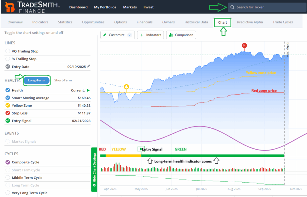
NVDA has been in the Green Zone since triggering an entry signal in May. You can see the price of the stock in blue shading, with the Yellow and Red Zone price levels clearly marked.
Just below the price chart and above the volume window, you can see the health indicator zones. This lets you visually track the stocks progress – moving from Red Zone on far left of the chart, into Yellow, and finally into Green.
You can now toggle back and forth between the long- and short-term health indicators to more fully evaluate any stock across different time frames.
So, let’s take a closer look at our new Short-Term Health Indicator using NVDA.

As you can see above, the short-term health indicator operates in a similar way as our traditional long term health indicator, with similar settings and display that look familiar on the chart.
But the key difference is that the short-term health focuses on briefer trends that may last less than three months, though some can extend longer.
Our extensive research and back testing of the short-term health indicator tells us…
🟢ST Green: Signals a healthy upward trend that may persist about two months on average.
- On average, stocks in the S&P 500 gained 13.7% in this signal.
🟡ST Yellow: Signals last about two weeks on average and marks a transitional stage between bullish and bearish conditions.
- On average, stocks in the S&P 500 gained 1.5% on in this signal.
🔴ST Red: Signals an unhealthy downtrend that may persist for two months on average.
- On average, stocks in the S&P 500 lost -4.3% in this signal.
So, you can see that the short-term health indicator is a useful tool for active investors who may want to take advantage of momentum shifts over a shorter period of time.
Used together, the two different time frames can complement each other.
By combining the long- and short-term health Indicators, investors can better understand both the big picture trend and the short-term shifts that influence price movement.
This layered perspective helps guide smarter trading and risk management decisions.
Long-term health will continue to be used to define the overall risk level of a position, while the short-term health is intended as a supplementary tool.
For example, you may want to buy the dip in a stock that’s in a long-term uptrend.
When the short-term health signal turns Green, that becomes a buy-the-dip entry signal.
Think of this as an early entry alert for the stock. Your risk level would be limited to the price level of the long-term Red Zone stop.
More aggressive traders with a shorter time horizon could also use the short-term health indicator as a standalone strategy – buying when it turns Green and selling when the signal turns Red.
Mike Burnick’s Bottom Line: The new short term health indicator complements our proven longer-term Green-Yellow-Red Health Indicator system. But it provides you with a unique, shorter-term perspective on the health of any asset. Using both in combination helps you better manage risk and instantly alerts you to fresh buying opportunities – whether you’re a long-term investor or a short-term trader.
❗ Additional Update from Our Development Team
Along with introducing the Short-Term Health Indicator, we’ve also made a minor, but important change to the VQ% alerts that applies only to stocks with sky-high VQ.
Starting today, we will cap alerts on sky-high VQ values at 55%. The reason is, based on extensive research on stock prices, that if a stock falls 55% or more in value, there are very low odds of the stock price recovering.
For example, if a stock has a Volatility Quotient of 65%, the VQ alert will be capped at 55%. But you can still set a custom trailing stop at a lower level if you wish.
Good investing,
Mike Burnick
Senior Analyst, TradeSmith
P.S. At TradeSmith, our mission has always been to give everyday investors smarter tools to trade with confidence. The launch of our new Short-Term Health Indicator is just one example of how we continue to help you learn how to become a better trader.
Yet as exciting as this breakthrough is, what’s about to be revealed goes beyond anything we’ve shared so far – a shift that could fundamentally change how profits are made.
It’s called the T-Line, and it shows you – in real time – exactly what to buy and what to sell for the chance at profits as high as 112%, 172%, and even 519% in a single afternoon.
On Tuesday, Sep. 30 at 1 p.m. ET, we’ll reveal it live. You’ll be among the very first to see how the T-Line could transform years’ worth (or even decades’ worth) of market gains into just hours.