The Exit Signal Playbook
The Moment Everything Changed
October 19, 1987. Black Monday.
The Dow Jones plummeted 22.6% in a single day – the largest one-day percentage decline in stock market history. Fortunes evaporated. Retirement accounts were devastated. Investors who thought they were diversified, sophisticated, and safe watched helplessly as their portfolios imploded.
But here’s what almost nobody knows: TradeSmith’s system – had it existed back then – would have gotten you out three days before the crash.
Not through luck. Through pure mathematics.
And it wasn’t just Black Monday. Our backtesting shows the system also would have signaled exits before:
- The dot-com crash of 2000 (when the Nasdaq ultimately lost 78% of its value)
- The 2008 financial crisis (when the S&P 500 dropped 57% peak to trough)
And our system told TradeSmith users to get out before the COVID-19 crash of 2020 (when markets fell 34% in just 33 days).
That instance was NOT a backtest. That’s a real example of TradeSmith protecting subscriber wealth using two related breakthrough concepts that changed everything investors thought they knew about risk management.
And those concepts are the Volatility Quotient (VQ) and the Health Indicator.
This playbook reveals how these tools work, why they’re so powerful, and how you can use them to protect your wealth in the next market crisis.
The Problem Every Investor Faces
Let’s start with a universal truth: buying stocks is easy. Knowing when to sell is torture.
Most investors use one of three terrible approaches:
Approach #1: The “Buy and Hope” Strategy
This is the classic advice: buy quality stocks and hold them forever. Ride out the storms. Dollar-cost average through the pain. Time in the market beats timing the market.
Sounds wise, right? There’s just one problem: it requires you to watch your portfolio lose 50%, 60%, even 80% of its value during crashes while doing nothing. It demands superhuman emotional discipline that almost nobody actually has.
Approach #2: The “Gut Feeling” Method
These investors try to read the tea leaves. They watch CNBC. They react to headlines. They sell when they “feel” nervous and buy back when things “feel” safe.
The result? They panic-sell at the bottom and buy back at the top. They turn temporary market corrections into permanent portfolio damage. Studies show that the average investor dramatically underperforms the market – specifically because of bad timing driven by emotion.
Approach #3: The “Arbitrary Stop-Loss” Trap
Some investors use stop-losses: “I’ll sell if it drops 10%.” Or 15%. Or 20%. Pick a number.
But here’s the fatal flaw: a 10% drop in Coca-Cola (KO) means something completely different than a 10% drop in a volatile biotech stock. The same percentage decline can be normal, healthy volatility in the more volatile stock, but a five-alarm fire in the steady, less risky stock.
What investors desperately need is a system that is:
- systematic but not arbitrary,
- objective but not rigid,
- mathematical but not heartless.
Enter the Volatility Quotient
The Volatility Quotient (VQ) solves the problem that arbitrary stop-losses can’t: it measures risk in context.
Here’s the breakthrough insight: every investment has its own personality, its own rhythm, its own “normal.” Tesla routinely swings as much as 44% from its highs to lows – that’s just normal movement for that stock. But a utility stock moving 44% in a day? That’s a catastrophe.
The VQ measures how far an investment has fallen relative to its own typical volatility patterns. It answers the question: “Given how this particular investment normally behaves, is this price decline unusual and dangerous, or is it just normal market noise?”
The beauty is this: The TradeSmith VQ alerts are personalized to your entry point. It doesn’t care what price other investors paid. It calculates a risk-based exit plan based on where you got in.
The Health Indicator: Where VQ Meets Genius
The VQ was revolutionary. But TradeSmith didn’t stop there.
Here’s the challenge with VQ: it’s tied to your personal entry point. That’s powerful for managing your specific position. But what if you’re watching an investment you don’t own yet? What if you want to know whether a stock, or even the market itself, is healthy, regardless of when anyone bought in?
That’s where the Health Indicator comes in.
How Health Builds on VQ
The Health Indicator uses the exact same mathematical framework as VQ, but with one critical difference: instead of measuring declines from your entry point, it measures decline from the investment’s most recent high, using an at-a-glance, color-coded stoplight system.
Think about what this means. The Health Indicator shows you whether an investment is trading in healthy territory right now, from an objective market perspective. It answers the question: “If I were considering buying this today, is it in a healthy state, or is something wrong?”
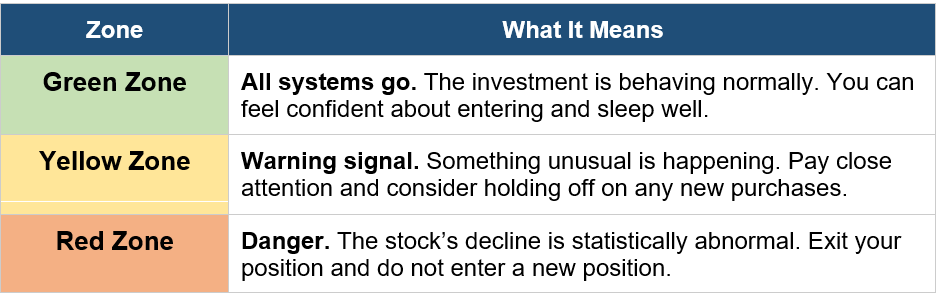
Used as an exit strategy, the Health Indicator is more conservative and risk-averse than a personal VQ reading. Here’s why:
- Your personal VQ might still be well above an exit point if you bought at a good price, even while the overall market is deteriorating.
- The Health Indicator will turn yellow or red based on how the investment is trading relative to its recent peak, giving you an earlier warning that trouble is brewing.
Why This Matters for Market Indexes
When you’re tracking broad market indexes like the S&P 500, Nasdaq 100, or Dow Jones, the Health Indicator is exactly what you need.
Here’s why:
- Universal perspective: Everyone can see the same Health reading, regardless of when they bought in
- Market wide signals: When the S&P 500’s Health Indicator flashes red, it means that the entire market is unhealthy – not just your personal position
- Earlier warnings: The Health Indicator catches deteriorating conditions before an investor’s personal VQ alert would trigger
- Perfect for index investing: Since indexes are meant to be held long-term, the Health Indicator keeps you invested during healthy bull markets while getting you out before major crashes
The historical data proves this works. Let’s look at the evidence…
The Proof: Four Decades of Perfect Storm Navigation
Talk is cheap. Data is everything.
We backtested the Health Indicator on the three major U.S. market indexes from 1980 through January 2026. The strategy was brutally simple: buy when the Health Indicator is green, sell when it turns red.
Rinse and repeat. The results will blow your mind.
S&P 500: The Gold Standard
Over 46 years, the Health Indicator would have generated 20 distinct entry and exit signals on the S&P 500.
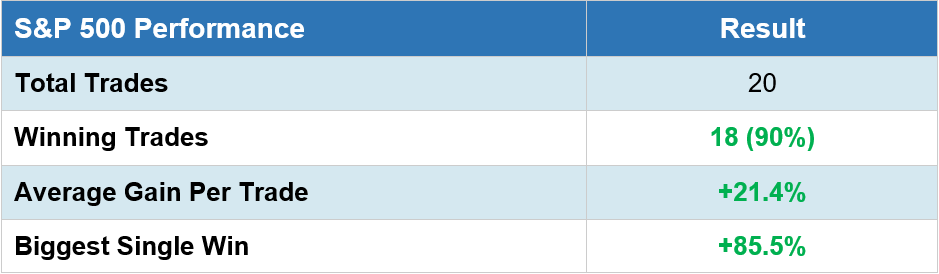
The Legendary Exits:
- Thursday, October 15, 1987: The Health Indicator would have flashed red and took you out three days before Black Monday, the worst single-day crash in market history. You would have locked in a 65.3% gain. Meanwhile, buy-and-hold investors watched their portfolios implode.
- Wednesday, August 15, 2007: While Wall Street’s finest were still celebrating record bonuses, the Health Indicator would have gotten you out before the Great Financial Crisis with a 42.3% gain after holding for over four years. Thirteen months later, Lehman Brothers collapsed and the S&P 500 eventually plunged 57%.
- Thursday, February 27, 2020: The Covid-19 pandemic was just beginning to make headlines. Most investors were in denial. But our Health Indicator for the S&P said “get out.” Over the next month, the market dropped 34%. (Reminder – this is example was not a backtest.)
But here’s the beautiful part: the Health Indicator does more than just protect you from losses. It gets you back in when conditions stabilize. After the COVID crash, it signaled re-entry on March 27, 2020. That single trade captured a 57% gain over the next two years.
Nasdaq 100: Taming the Tech Beast
The Nasdaq is the wild child of indexes – higher highs, lower lows, absolutely brutal during crashes. The Health Indicator turned that volatility into opportunity.
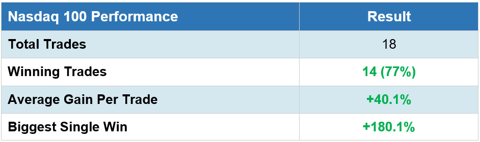
The Exit That Saved Everything:
- April 14, 2000: At the absolute peak of the dot-com bubble, when tech stocks were trading at insane valuations and everyone from taxi drivers to CEOs was convinced the Internet had created a “new paradigm,” the Health Indicator flashed red.
Our backtesting show the health indicator would have had investors exit with a 130% gain.
Over the next 30 months, the Nasdaq plunged 78%. Buy-and-hold investors who rode it down lost nearly eight decades of gains. The Health Indicator would have saved them from the worst crash in modern history.
Dow Jones: Protecting Blue-Chip Wealth
The Dow is boring. Steady. Safe. Or so everyone thinks. The Health Indicator proved that even America’s most stable companies need risk management.

Notice something remarkable: across all three indexes, over decades of testing, the Health Indicator maintained a 77%+ win rate. That’s not luck. That’s mathematics protecting you from disaster.
Your Action Plan: Making It Real
Theory is worthless without execution. Here’s exactly how to use the Health Indicator to protect your portfolio.
TradeSmith subscribers get real-time Health Indicator readings for any stock or ETF. You can securely sync any brokerage account for timely alerts on any position in your portfolio. Or you can create a watchlist and add SPY, QQQ, and DIA to track the markets at an index level. Check them regularly – ideally daily, but at minimum weekly.
What you’re watching for:
- Green to Yellow: Pay attention. Markets are getting choppy. Don’t panic, but be ready.
- Yellow to Red: EXIT. Sell your position. Move to cash or defensive assets. The historical data says get out now. You can also get an alert at your registered email address or in the TradeSmith app to ensure you don’t miss any crucial updates.
- Red to Green: Re-enter. The storm has passed. Get back in and ride the recovery.
Here’s what will happen: you’ll get an exit signal. You’ll sell. And then the market will keep going up for a while.
You’ll feel like an idiot. You’ll question everything. CNBC will be celebrating new highs while you’re sitting in cash.
Do not override the signal.
The Health Indicator doesn’t try to catch the exact top. It’s designed to get you out before the catastrophic decline. Yes, you might miss the final 10% or 20% of a bull run. But you’ll avoid the 50% crash that follows.
Remember: October 1987, April 2000, August 2007, February 2020. In every case, the signal came before the disaster. Trust the math.
The Bottom Line: Mathematics vs. Disaster
Most investors lose money not because they pick bad stocks, but because they don’t know when to sell. They ride winners up and then all the way back down. They turn 100% gains into 50% losses. They let fear and greed make their decisions.
The Volatility Quotient and Health Indicator solve this problem with pure mathematics. No emotion. No guessing. No watching CNBC and hoping for the best.
Just clean, quantitative signals that have been shown to work through:
- The 1987 crash
- The dot-com bubble
- The 2008 financial crisis
- The COVID crash
- And every other major market correction over the past 46 years
The next crash is coming. We don’t know when. We don’t know what will trigger it. But we know it’s coming because crashes always come.
The question is: will you be ready?
The Health Indicator is your early warning system.
It would have kept investors safe through Black Monday.
It would have gotten them out before the dot-com crash.
It would have saved them from the financial crisis.
It DID protect them during the pandemic.
It can protect you next time.
Ready to Get Started?
TradeStops Plus subscribers have immediate access to the Health Indicator for every stock and ETF. Log in now and add SPY, QQQ, and DIA to your watchlist today and start monitoring the signals.
The next market crash is coming. The only question is: will you see it before everyone else?