Bet you didn’t realize how bullish “death crosses” were…
But how do they hold up to the “golden cross”?
Jeff Clark is bullish on bitcoin miners…
Why TradeSmith’s AI will just keep getting better…
If you still had any doubt we’re in a bear market…
The Nasdaq 100 closed more than 20% below its all-time high set in late February. That’s a bear market.
The S&P 500 traded 20% below its all-time high intraday on April 7. I’ll call that close enough.
And for us here at TradeSmith, both of these key benchmarks went into the Red Zone on April 4. That’s even more important, because those zones are determined by each benchmark’s individual volatility.
It doesn’t matter how fast it was. Nor how it was brought on by rapid change in economic policy.
Stocks are in a bear market.
You have to keep that in mind whenever you trade right now. The bias and risk is still tilted to the downside.
Stocks are more likely to continue going down a bit than they are to put on another miraculous V-shaped recovery. (But as you’ll see in a minute, it’s likely that most of the damage has already been done.)
The only way that happens is if the Federal Reserve or President Donald Trump come to save things. But at least right now, neither of them seem interested. One is still in “wait and see” mode, not sure if the economy will even need help – and the other is trying to fire the first… while being the reason the economy probably needs help in the first place.
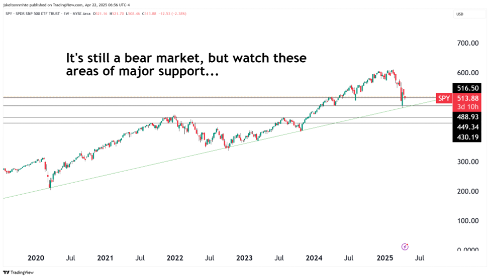
That’s out of our control. So let’s focus on the price action. What clues can we find on the chart of the S&P 500 about how to proceed?
The recent flush has given us a dire, but inarguable area of rising support.
Spanning all the way back to the 2020 crash and charting there through the 2022 and 2023 lows, we have a rising green support line. It represents the broad-based uptrend of the 2020s. It’s also where the bulls stepped in to buy stocks big-time a couple weeks ago:
It would be poetic for the bear market to have ended right there. But it’s no guarantee.
Still, should we see prices around that area again, it would not be a horrible spot to add more long exposure. Especially since that also happens to be the site of the early 2024 lows.
Beneath that is another key level – the range between 4300 and 4500 on the S&P 500. That area represents both the 2021 bull market top, the early 2023 top, and the site of four major upside tests below 4300 that we saw in those same years. There’s a lot of history with these levels, and any trip down to them will result in some chop and a lot of buying interest.
That’s where things stand today on the benchmarks.
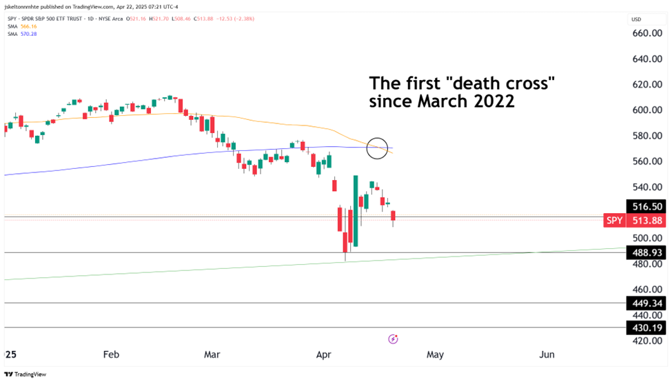
But there was another big technical development recently…
Stocks just showed the infamous “death cross” signal – when the 50-day moving average crosses below the 200-day moving average.
Take a look… We got the first death cross in over three years last Tuesday:
This is a rare cross that’s supposedly associated with major downtrends. At least, that’s how the mainstream media likes to spin it.
What they don’t mention (and might not even know) is that death crosses are not just bear market signals. They come during any period of strong volatility – like during the last trade war at the end of 2018. That wasn’t fun, but neither was 2015, 2016, or 2010… or 1998 or 1994… or 2020, for that matter. But none of those times were the start of a prolonged bear market.
Now, naturally we also saw it happen in 2008. We saw it happen in 2000. And importantly, we saw one at the beginning of the last bear market – 2022. So yes, we do see it at the start of bear markets just the same.
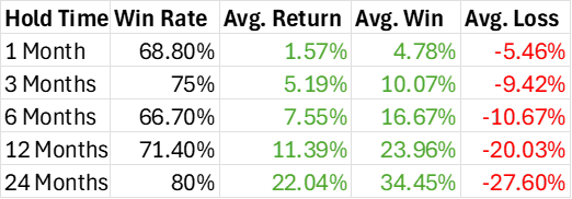
But as it turns out, the track record of a death cross is overall kind of spotty.
Since 1990, we’ve seen 16 death crosses on the S&P 500. Here’s what happened after, on various hold times:
The “death cross” doesn’t seem so scary now, does it?
In fact, it seems almost like the kind of thing you see closer to the end of bear markets than the beginning…
Now, to be clear, there are two key examples of times when death crosses led to further painful losses. That’s what the longer timeframes on that last column are all about.
Those are the truly devastating bear markets – the 2000 and 2008 drawdowns that seemed to never end. And there’s no reason that can’t still happen this time.
But the majority of the time, the reality is that “death crosses” are buy signals on both short- and long-term timeframes. That’s worth thinking about.
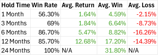
It’s also worth thinking about the opposite signal, the “golden cross” that’s supposed to herald in new bull markets. We’ve seen 16 of these since 1990 as well.
Let’s do the same thing here we did with the death cross:
So there’s a funny thing you might not have expected: On the whole, death crosses are more reliable one- to three-month buy signals than golden crosses. They have higher win rates and considerably higher average positive returns.
In terms of win rate, longer-term trades from golden crosses are incredibly strong. But the average winning gain is still dwarfed by the death cross on the six- and 12-month timeframes.
How can this be?
Quite simply, bull markets are a lot more common than bear markets. And because of that, investors will always (and rightfully) doubt the bear market in the early innings. Plus, as we talked about, there have been plenty of death crosses that didn’t lead to prolonged bear markets. That explains why the short-term returns are more consistently positive in death crosses.
But what we can’t ignore is that, 24 months out, golden crosses have never been wrong, with stocks always higher and 31.8% higher on average.
We can’t know whether or not this is one of those 2000- or 2008-style bear markets just yet. But recent history shows we should not be so willing to give up on stocks just yet.
This unusual bitcoin trade caught my attention…
If you’ve been spending any time with TradeSmith the last couple months, you know Jeff Clark just joined the fold.
Jeff’s one of the smartest technical traders around, a master of momentum and mean reversion. He understands the relationships between asset classes, and knows the best way to play them when things get out of whack.
Things are pretty out of whack right now in the bitcoin sector. Not with the asset itself, but with the publicly traded bitcoin mining stocks.
Here’s Jeff writing in his free e-letter, TradeSmith’s Market Minute:
For the past three weeks, bitcoin has been stuck in a tight trading range near the $85,000 level. This consolidating action has allowed all of the various moving averages to coil together and build up energy to fuel the next big move.
And, after yesterday’s rally, it appears “the next big move” will be to the upside.
But, as bullish as the setup is in bitcoin, the bitcoin mining stocks look even better.
Bitcoin and the bitcoin mining stocks tend to move in the same direction. When bitcoin is in rally mode, so too are the miners. When bitcoin is falling, the miners tend to decline right along with it.
But something unusual has been happening for the past several weeks. While bitcoin has been chopping back and forth in a trading range between $76,000 and $86,000, the bitcoin miners have been declining to new lows.
The stock declines have been so severe, the miners now trade at the lowest value ever relative to bitcoin. Take a look at this ratio chart comparing the performance of bitcoin versus the CoinShares Valkyrie Bitcoin Miners Fund (WGMI)…
When this chart is rising, bitcoin mining stocks are outperforming bitcoin. When the chart is falling, the miners are underperforming.
The relative underperformance of the miners has never been this extreme.
That means one of two things must happen to bring it back into its historic range. Either bitcoin needs to fall, or the bitcoin miners have to rally – or some combination of the two.
Similar to the gold mining stock catch-up trade we called out recently, Jeff sees potential in bitcoin mining stocks catching up to the relative strength of bitcoin.
And he’s put his money where his mouth is, with a trade on WGMI for his Delta Report readers.
Keep an eye on this ETF and the individual bitcoin miners in the days and weeks to come. Chances are, you’ll start to see a powerful “catch-up” trade emerge.
TradeSmith’s AI is getting better all the time…
Every day, new data comes into the TradeSmith system. An uncountable array of millions of data points across tens of thousands of assets.
Part of the data has an incredibly important job. It tells us, every single day, how effective the stock-price projections have been from our Predictive Alpha algorithm, which we nicknamed An-E.
Whenever a stock hits the price we projected it to – and whenever it doesn’t – our system takes note and updates the projection automatically.
In short, every day of price action makes the Predictive Alpha system even more powerful… and more capable in finding you great trades.
If you’re already a Predictive Alpha subscriber, I’d like to share a tip with you today.
In our system, we track how accurate each Predictive Alpha projection has been historically. We track this in two dimensions: with the directional accuracy – that is, whether the stock went in the same direction as the original projection – and with the “Touch Rate,” as we call it – which measures whether the price traded at the projected price.
The stocks with the highest rate of accuracy on both measures are some of the best projections to track and trade. Here are the top 10, sorted by Touch Rate:
If you’re trading using Predictive Alpha, these stocks are worth keeping on your watchlist.
What’s even better about AI tools like this is that they not only do their job now – in this case, forecasting a stock price weeks into the future – they also learn on the job.
With each new data point it analyzes, An-E becomes “smarter”… and incredibly quickly at that.
While forecasting prices for mega-caps like Tesla, Apple, and Nvidia… as well as mid-caps, small caps, and ETFs… over 1,000 different assets in all…
An-E now finds the optimal day to take profits on that specific stock for the best odds of success.